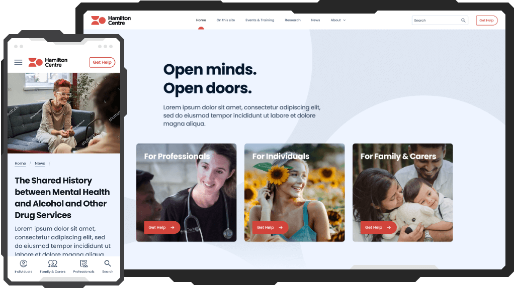
The Hamilton Centre Clinical Network's website, dedicated to delivering clinical addiction specialist care across Victoria, serves as a pivotal hub connecting consumers with co-occurring mental health and high-intensity addiction needs to the collaborative network's initial services.
The seamless and intuitive design of the website is the key to ensuring accessibility and efficiency, enabling clinicians and consumers alike to navigate and engage with the platform effortlessly.
Taking the lead in designing a website for mental health and addiction support, I faced some exciting challenges. Guided by a user-centred approach to ensure a seamless user experience, my main focus was finding the right balance between creating a compassionate design and ensuring top-notch functionality, which also involved strategically integrating it with Nuxt.js and Tailwind.
Meticulous attention was also given to maintaining design consistency across components and sticking to established brand guidelines.
Successfully tackling these challenges led to a platform that's not only responsive and empathetic but also strategically designed for open-minded treatment and support prioritizing the needs and experiences of the users.
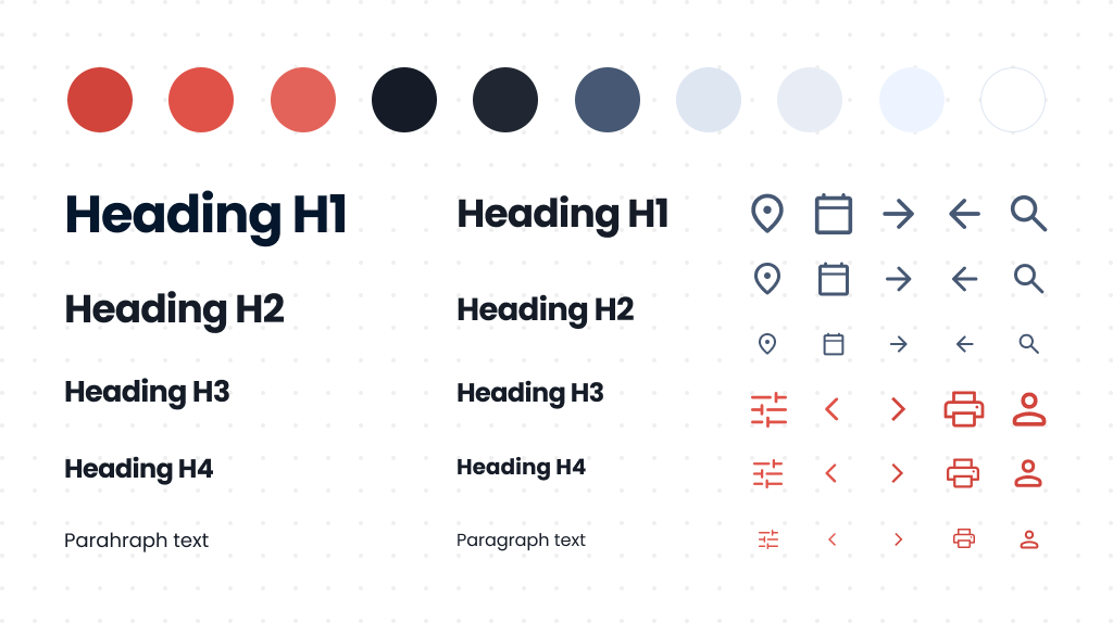
I used colors and font types according to the existing brand guidelines to visualize the brand's vision through the design. In the context of mental health and addiction support, the predefined color palette goes beyond aesthetics – it serves as a visual language to convey empathy, trust, and support. However, the original color palette didn't work well for dynamic states and background animations. Consequently, I found it essential to expand the palette to include the needed range of colors and functionality.
A standardized naming convention was devised to seamlessly integrate with the Tailwind framework on the front end. This ensures that developers can easily apply and manage styles within the project.
I established a headings hierarchy to ensure optimal readability across various screen sizes and to accommodate all possible content and component usage scenarios. This becomes a crucial aspect for a content hub teeming with textual information, especially if it's focused on individuals with mental health concerns.
To maintain design consistency and mitigate potential performance issues during font rendering or loading in the browser, I limited and standardized the selected font types across the entire project.
As a big fan of Google Material Symbols and Icons, I used it to ensure consistency, scalability, and accessibility in designing visually appealing and user-friendly interfaces for the Hamilton website.
The library is extensive, catering to all project requirements, compatible with a variety of Front End frameworks, plus it's completely free. I made this strategic decision based on my firsthand experience as both a UI/UX designer and Front End developer as I recognize the challenges developers face in maintaining consistency, scalability, and front end integration.
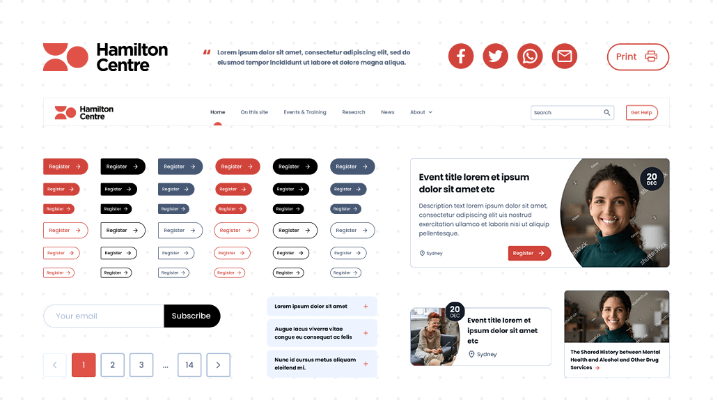
Identifying and utilizing consistent UI elements and patterns across a website was crucial for creating a cohesive and user-friendly design. This practice not only enhances the overall user experience but also contributes to brand recognition.
I crafted each piece following the Atomic Design principles, carefully considering identified patterns and embracing modularity. This design approach transforms components into versatile building blocks, effortlessly combinable and customizable for a variety of purposes. On the front end, developers can wield these ready-made components like creative tools, slashing redundancy and accelerating the implementation of common UI features.
This isn't just about squeezing everything into a smaller screen – it's a bunch of problem-solving tricks. I cherry-pick the must-have features, trim down the content to the essentials, and dive deep into crafting user interactions within the tight space. Why? Because over 90% of users are on their mobile devices!
In the design process, I brought a touch of magic to responsiveness. The use of horizontal sliders serves to dynamically display content, while collapsible menus efficiently maximize screen space on various devices, both saving users from endless scrolls. Paddings were thoughtfully reduced on mobile interfaces to enhance touch-friendly interactions. Finally, the "Call to Action" (CTA) card was deliberately placed as the last slide in sliders, ensuring users don't experience a sudden dead end and smoothly guiding them towards the next step. It's not just about responsiveness – it's about crafting an experience that's as engaging as it is intuitive.
When it comes to component states, I made sure to cover all the bases. This means clear visuals for when UI elements are collapsed or expanded, ensuring users easily understand the status of the interface. The active and hover states were given special attention – each crafted with specific styles. It guarantees users receive clear feedback when interacting with elements with a clear understanding of their navigation within the website.
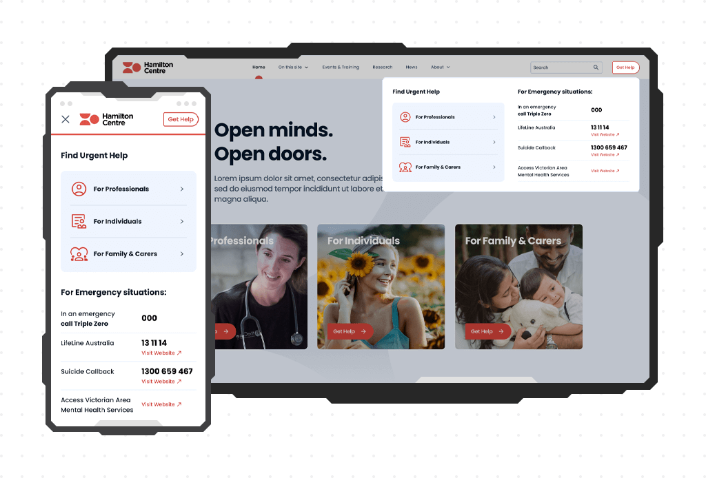
In addition to the standard Hamburger-menu navigation, I've added a secondary App-like navigation panel at the bottom of each page for quick access to essential sections and tools like Search. This practical feature helps address potential high exit rates, especially for users arriving from external links or ads unrelated to their query, or those who may get lost while navigating or scrolling through content. It serves as a reliable guide to ensure users stay on course and find what they're looking for.
I categorized typography sizes into two distinct groups – one tailored for mobile devices and another for desktop screens. These groups are intended for use by developers, who can implement responsive font sizing using the CSS clamp() function. This approach ensures that the heading remains legible on smaller screens, scales proportionally on medium-sized screens, and caps the size on larger screens to avoid excessive enlargement.
The website design was developed in compliance with WCAG (Web Content Accessibility Guidelines). For example, I checked color combinations with a Contrast Checker to ensure they met accessibility standards for users with visual impairments, and to ensure that the content looks good and is easy to read and accessible to everyone. This perfectly aligns with the principles of inclusive design, ensuring that the digital space welcomes and accommodates a broader audience.
I merge design critiques, collaborative reviews, and stakeholder feedback to refine my work. Regular sessions with the team and stakeholders have enhanced both the visuals and functionality of the design. This iterative process not only shapes a polished product but also sharpens my skills, thanks to valuable insights from our internal crew and external stakeholders. It's not your average work routine, it's a creative journey that keeps things exciting and my skills razor-sharp.
As someone skilled in both UI/UX design and Front End development, my collaboration with the team goes beyond the usual. This dual expertise allows me to connect design and functionality seamlessly. By clearly understanding both sides, I create designs that not only look good but also align with what developers can successfully build.
This approach has been instrumental in making sure my projects not only meet creative expectations but also navigate the technical landscape effectively. The success of my projects is a direct result of this well-rounded collaboration, where design critiques and teamwork aren't just part of the process but elevate both the creative and technical game. It's not just work, it's a dynamic blend of creativity and collaboration that brings success to every project.
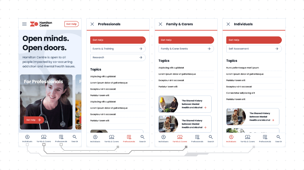
The primary goal of prototype development was to highlight the comprehensive flow and functionality of crucial website elements, including features like horizontal sliders on the mobile platform and navigation menus.
Initially, it aids stakeholders and developers in gaining a clearer understanding of the website's flow and features. Ultimately, it facilitates the validation of the user flow through testing with potential users or stakeholders, allowing for necessary adjustments to enhance the overall user experience.
Open Figma Prototype (Password required)