The Bridge Partners application is a social platform tailored for Bridge game enthusiasts. Structured like a dating app, it serves as the ultimate hub for finding ideal partners for both casual games and participation in global Bridge events.
Designing a mobile app posed significant challenges, particularly in navigating a limited budget and meeting a tight deadline. With the absence of established brand guidelines, I assumed the dual responsibility of defining the brand identity and creating the app design from scratch. Also, the initial information provided included only basic user-flow and IA, giving me a wide scope for interpretation. What an exciting challenge!
To tackle this, I focused on detailed wireframes to fix gaps in the user-flow and structure. Once I had a solid foundation, I designed the app's look and navigation, ensuring it not only adhered to the newly established brand but also remained functional and user-friendly.
Ultimately, overcoming these challenges led to the creation of an interactive prototype meticulously tailored for effective user testing.
When it comes to crafting a seamless user experience in a tight deadline, visualizing the design in detail early on is a game-changer. Skipping the low-fidelity stage allows for the development of a more polished design, resulting in time savings during the transition between the low-fidelity to high-fidelity stages. This approach not only maps out the overall structure and flow of the interface but also actively identifies potential issues and gaps in user interaction, particularly in terms of poor user-flow and information architecture (IA). Moreover, it provides a clearer visualization of the final product and promotes improved communication with stakeholders.
This proactive strategy not only reduces the likelihood of extensive later-stage revisions but also translates into significant savings in both resources and time throughout the entire design process.
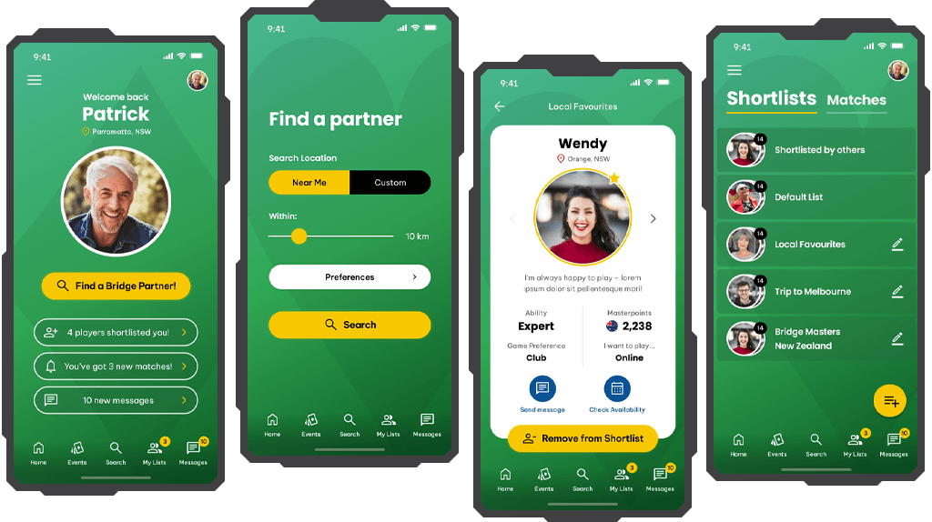
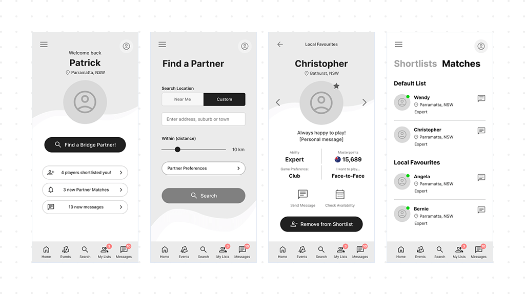
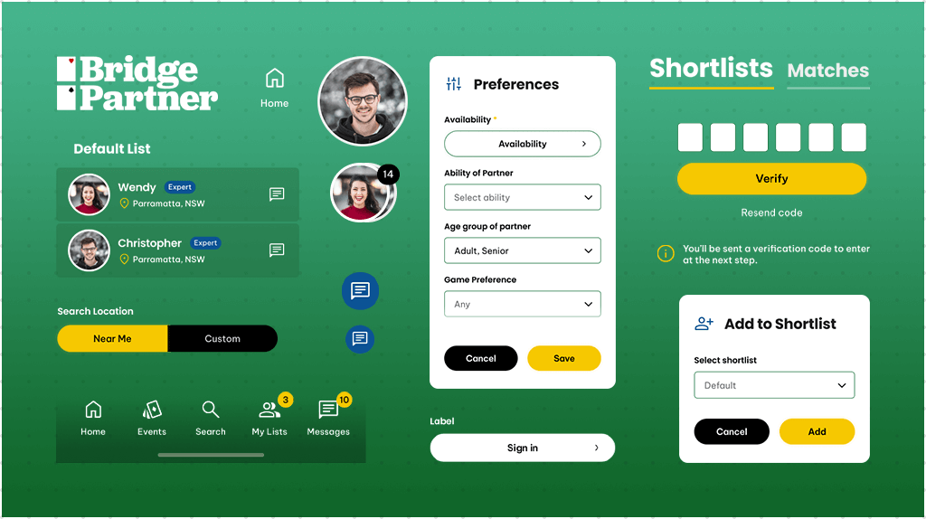
The initial phase of designing the application, specifically focusing on the registration process, was straightforward. It's a simple process where users register using their email, making it the most convenient entry point into the app. After registration, users are prompted to complete their profiles, providing information about themselves and their ideal partners. This enables the system to match them with compatible players based on location and preferences like availability or skill level.
The overall design concept draws inspiration from dating apps. Users can browse through different profiles, selecting ones that catch their interest, while also managing their own profiles. To facilitate this interaction, a swipeable profile screen, commonly seen in dating apps, was implemented. This allows users to interact with potential players – they can send messages, check availability, and importantly, add profiles to a shortlist for future interaction or personal organization.
To streamline the user journey and enhance navigation between screens, I took two key steps. Firstly, I incorporated major links to all primary screens in the bottom navigation bar, serving as the primary means of navigation. Additionally, I included a few UI controls at the top of the app, such as "back" and "profile" buttons, to further facilitate user interaction and navigation.
During the design process, I paid special attention to crafting the information architecture (IA) for the events list. This involved providing users with the ability to filter events by location or date, as well as to join or leave events and browse other registered participants.
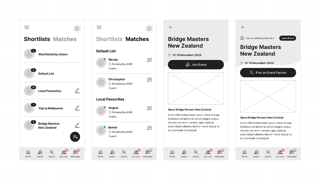
One significant outcome of this process was the creation of the Shortlists screen. This screen allows users to easily browse their lists, create new ones, or rename existing ones. Interestingly, the features related to custom Shortlists were not initially part of the project scope. However, they emerged during the development of the UX for the application.
This aspect of designing UX is particularly enjoyable because it demonstrates how a product can evolve through the application of a creative mindset. Witnessing this evolution is undoubtedly one of the highlights of crafting UX for a product.
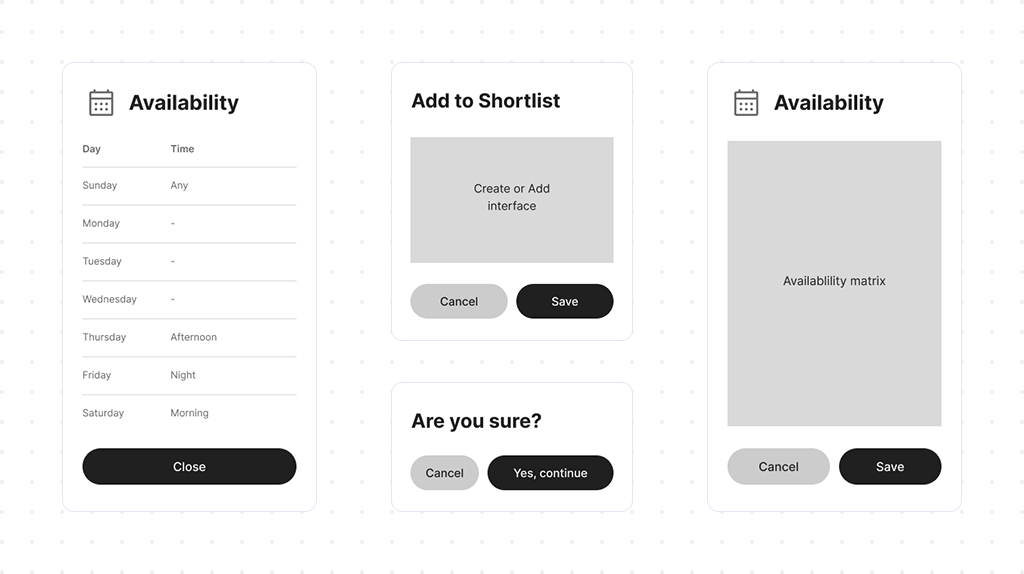
One of the fundamental principles of user-centered design is to ensure that users always feel in control when using the application. Providing users with a sense of control is crucial in preventing confusion and enhancing the overall user experience.
To address this, I implemented popup messages that give users additional control for sensitive actions that might require confirmation. This empowers users to proceed with confidence, knowing that their actions are deliberate and intentional.
Furthermore, to keep users informed and engaged, I incorporated loading screens to indicate that the application is still functioning while a search is in progress. This helps manage user expectations and provides reassurance that the application is actively working on their behalf.
To enhance the UX, the profile screen has been developed in two variants, offering a tailored experience for different user scenarios. The initial variant extends a warm welcome to new users, creating a personalized entry point into the app's ecosystem. The second one caters to registered users and offers more than just a friendly greeting. It unveils a broader perspective, carefully spotlighting significant events and interactions that took place while the user was offline. This considerate approach doesn't just recognize the user's past activities within the app, it cultivates a feeling of ongoing connection and involvement. As a result, every visit becomes a thorough and fulfilling experience.
I've seamlessly integrated vibrant badges into the app's interface, strategically placed to draw attention to the influx of incoming messages, pending requests, and promising new matches with potential partners. These eye-catching badges serve as visual cues, providing users with a quick and dynamic overview of their activity within the app, and ensuring they stay informed and engaged with evolving interactions and opportunities.
As part of the iterative feedback loop, I developed a fully functional prototype after the wireframing stage. This prototype was shared with stakeholders and the internal team to collect valuable feedback. The goal was to ensure that the desired functionality is comprehensive, the app flow is based on the insights gained, and the prototype is ready for subsequent stages.
Detailed Wireframes & Prototype (Password required)
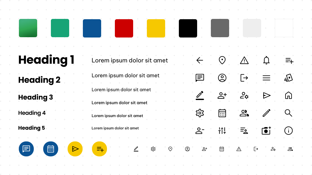
The primary emphasis for this design direction originated from a stakeholder proposal, which specifically highlighted the preference for a green color. In response, I implemented this choice as the main background color. The rationale behind opting for green is its association with traditional card tables commonly found in Bridge and other card games, adding a touch of familiarity to the user interface.
To maintain a visually appealing and user-friendly interface, I meticulously curated the rest of the color palette. The focus was on achieving an optimal contrast ratio and ensuring visual comfort for users during their interactions. Bright colors like yellow and blue have been strategically integrated for notifications and to accentuate key UI elements, ensuring a vibrant design that draws attention to essential components of the user experience.
To maintain consistency, two types of fonts were selected: one for headings and important elements, and another for the little guys like labels and texts. Font-tastic harmony!
Icons were created in three sizes to ensure they fit into the application like puzzle pieces. I took inspiration from Google Material Icons because, well, who needs to reinvent the wheel when Google's already invented the whole car?
While not initially mandated, the development aligns with Atomic Design Principles. This approach ensures the seamless reuse of components throughout the prototype, ultimately contributing to time-saving and enhancing overall efficiency and maintainability.
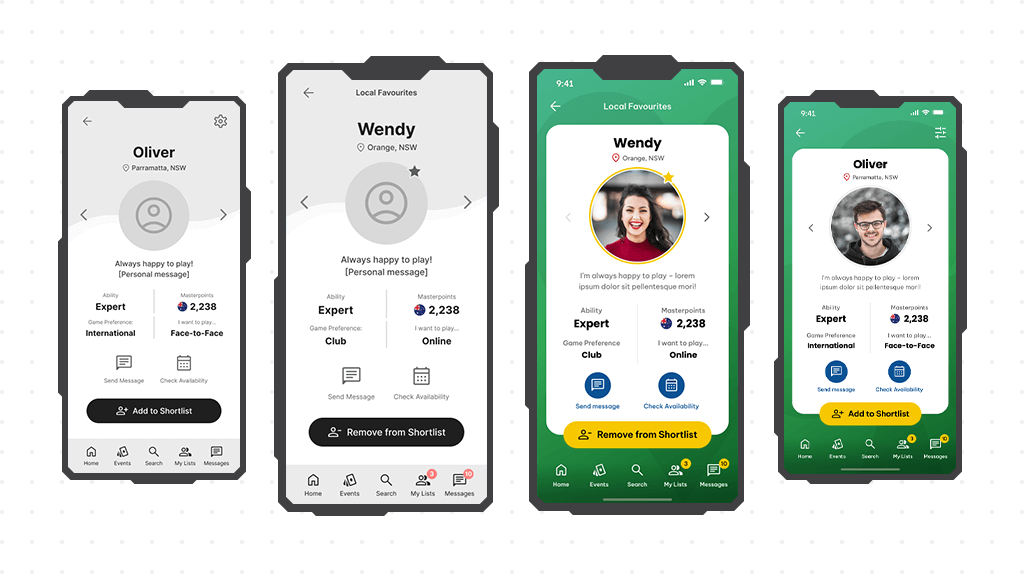
Drawing the profile screen turned out to be my biggest challenge compared to other screens. While its basic structure was laid out in the wireframing stage, during discussions with the team, we decided to give the profile a unique touch by shaping it like a playing card. One particular hurdle I faced was how to prioritize the Shortlist managing button on this card-shaped profile, ensuring it stole the spotlight without overshadowing the rest of the design. To address this, I ingeniously resolved the issue by overlaying the button at the bottom of the card, ensuring it remained prominent while maintaining the overall design aesthetic.
To make the brand easily recognizable, I added the classic shapes of playing cards – Spades, Clubs, Hearts, and Diamonds – as transparent background elements. This not only helps the brand stand out but also gives the entire app a friendly and familiar vibe, like your favorite deck of playing cards.
Turning the colored prototype into a masterpiece was easier than convincing a cat to take a bath. With just a sprinkle of tweaks after the final review (and maybe a bit of bribery with catnip), I had a prototype ready for thorough user testing.
Open Figma Prototype (Password required)In summary, the Bridge Partners App project was an exciting journey, presenting an interesting challenge in crafting a user experience from scratch while navigating tight time and budget constraints. From defining the brand identity to wireframing, designing interactive interfaces, and implementing a notifications system, each step offered its own unique set of challenges and opportunities for creativity and problem-solving. By leveraging Visual Design Principles like color selection, typography, and iconography, the resulting design not only met functional requirements but also resonated with the target audience. Witnessing the product evolve throughout the design process was truly magical, highlighting the transformative power of user-centered design. It's projects like these that fuel my excitement for creating meaningful and impactful user experiences that truly matter.