Compass, a content website committed to addressing elder abuse and fostering social awareness, aims to simplify the connection between users and relevant services. With the mission to streamline access to critical information, the platform is dedicated to making a positive impact in tackling the sensitive social problems associated with elder abuse. Given that 80% of Compass's audience engages with the content through mobile devices, adopting a mobile-first design approach was crucial.
As a UX designer, delving into analytics is not only about understanding user behaviour – it is a methodical exploration to identify gaps, address difficulties, and prioritize design efforts. I consider using analytics data to be my essential tool to make informed decisions and continuously improve the overall user experience of any digital product I develop. It helps me identify high-impact areas where design improvements can have the most significant positive effect on users' experience and track the impact of newly implemented changes over time. This case study outlines the results of utilising analytics tools in developing the Compass website.
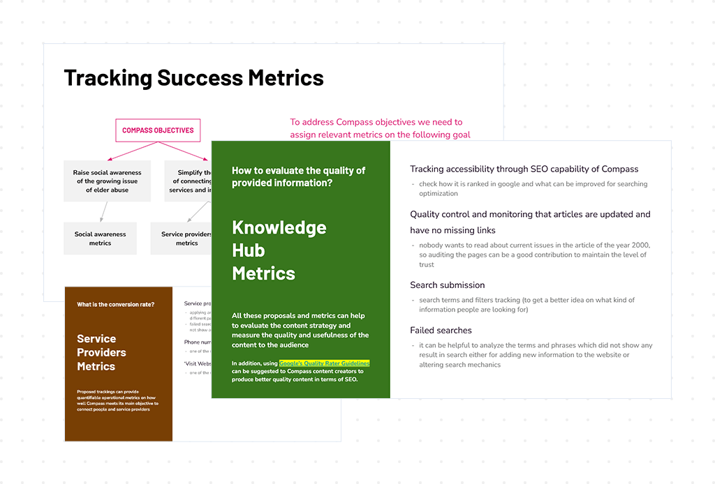
Considering the key business objectives, such as connecting users to service providers and raising social awareness, I started by mapping out the success metrics of the website's performance. Getting this clear vision of the business goals and current performance concerns allowed me to identify the number of qualitative and quantitative metrics that laid the foundation of the GA4 tracking plan. Working on this plan resulted in developing the primary objectives of an analytics strategy: Acquisition, Engagement, and Connection with service providers. Acquisition metrics focus solely on numbers, while most Engagement metrics provide a qualitative perspective. All these goals were backed by essential metrics. As a result, this documentation allowed us as a team to focus on the same goals, prioritize initiatives, and identify opportunities to grow.
In addition, I implemented the tracking for all the usability elements used on the website. It allowed me to track the performance of all design changes and measure how these changes impact the behaviour of our users.
Realizing the importance of precise data collection to make informed design decisions, I initiated tag setting as an essential part of any new feature launching. Moreover, I aimed to establish a well-organized tag management system that would allow easy navigation through the hundreds of data points we collect.
I approached this challenge by creating a standardized way of naming the tracking events. Each name string starts with the goal, then the name of the element users interact with and then with the action they do. For example, I labelled the events that contribute to increasing social awareness in the following way: soc_awe_file_download, or soc_awe_subscription_sign_up.
This approach allowed better consistency with naming the events and made it easy for everyone in the team to access and navigate the data. It also contributed greatly to linking and prioritizing our design initiatives in accordance with business goals.
Another amazing tool that adds an extra layer to my analytics toolkit is Hotjar. It enabled a comprehensive exploration of user interactions on the Compass website and helped to delve deeper into the user journey, capturing insights through heatmaps and session recordings.
When I started using Hotjar, a clear pattern emerged – only 30% of our users were scrolling to the bottom of our website pages. It's a common issue for content-heavy sites, especially with lengthy reads, where mobile users tend to disengage. The insights from Hotjar indicated the necessity to make those long content pages more user-friendly to reduce scrolling.
To address this challenge, I made some design tweaks. First, I standardized and reduced paddings across the entire website, specifically focusing on mobile responsiveness.
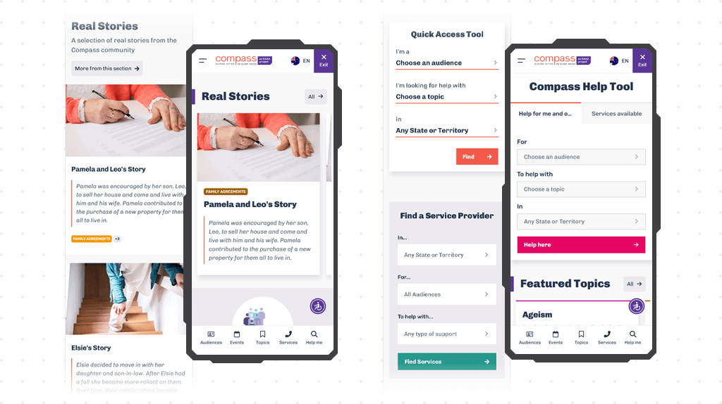
Our team also decided to combine certain components. For instance, we merged two separate search tools into one, featuring a tab-like function where users could easily switch between different options.
But the real magic happened when we shifted from vertical card grids to horizontally scrollable slides. It effectively reduced the space clutter on the interface and helped to create an even more engaging browsing experience.
All these design tweaks made a real impact - the percentage of users scrolling up to 90% through the pages increased by 25%. As a result, the implemented design solutions to address the initial challenge turned the Compass website into a more user-friendly and interactive space.
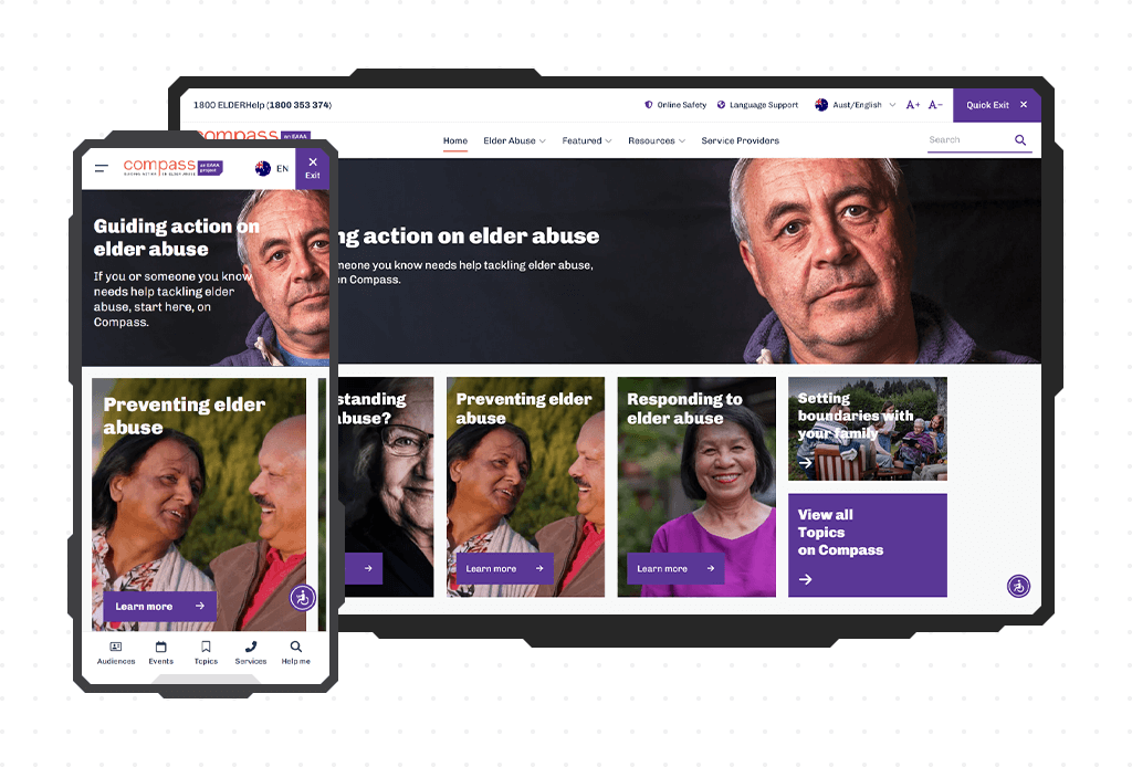
Although the average exit rate of the Homepage fell within the normal range, the analytics data indicated that certain elements failed to capture the expected attention. I found that the drop-down tabs were underutilized, suggesting a need to reconsider their placement to make them more prominent within the layout.
To address the issue, we decided to introduce content cards and positioned them directly below the top opening banner on the Homepage. And yes, we also relied on the analytics to guide our selection of topics featured on the content cards to align with user preferences and interests.
Within a few months after implementation, we observed a noticeable increase in page depth when the Homepage was the starting point for users' journeys. Boom! Success confirmed.
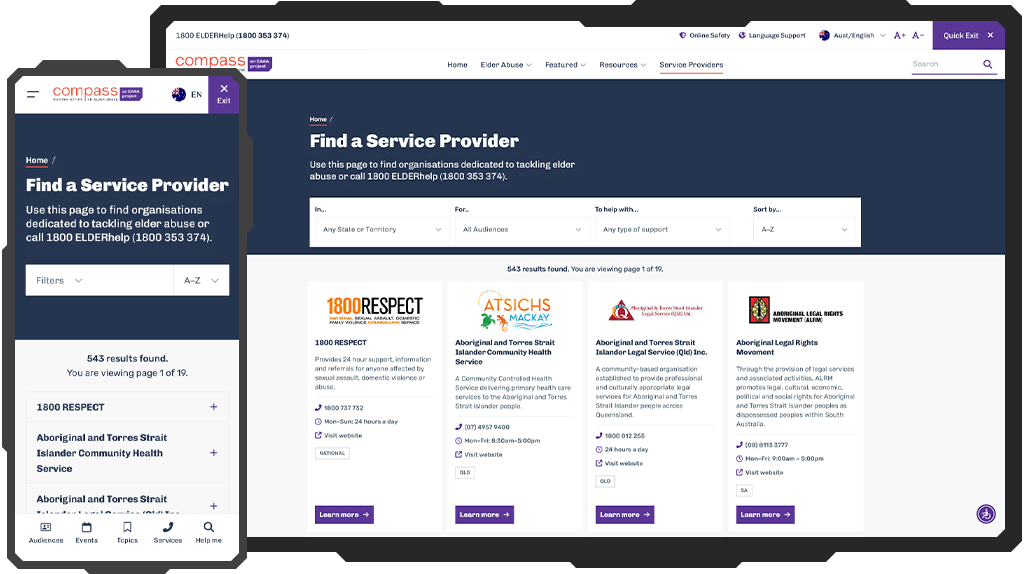
At the core of the Compass website was a crucial goal: linking users with available service providers. To achieve this, we always prioritized analytics data to identify areas for improvement. It became apparent that users sometimes struggled to navigate the content-rich website, so we focused on simplifying access to the service providers page to minimize clicks needed for users to access this page.
I explored various navigation options, taking time to experiment and refine our approach until the right solution was found. Eventually, we introduced an app-like bottom navigation bar, prominently featuring quick access to the Topics, Audiences, Events, Search and Service Providers page.
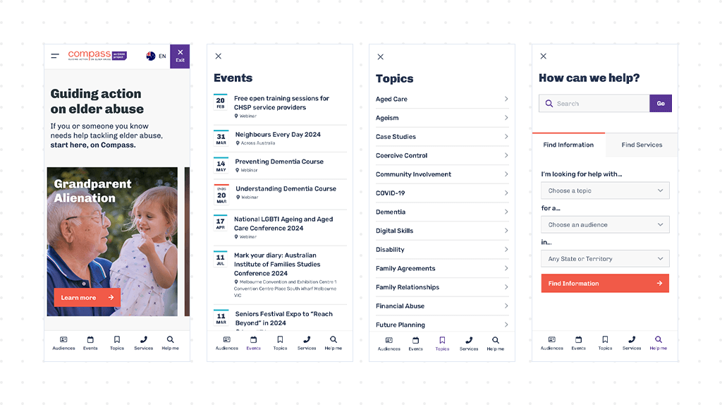
And guess what? Our users loved it! This feature significantly enhanced both user traffic to the page and the number of leads generated.
One of the challenges we faced was a high exit rate on our promoted content pages. Typically, a healthy exit rate for content websites falls between 40 to 60%. However, in our case, it exceeded 80%. Disaster!
While we understood that users visited these pages to engage with the promoted materials, we also wanted to keep them interested in exploring more content. Because we knew our promoted materials were like a mouse trap, we decided to put some cheese in it.
The solution was to implement a relative content block positioned in the first quarter of the page, acting as a call to action and encouraging readers to stick around and explore other materials.
In just one month, the relative content block became one of the top 5 events across the entire website, showing significant engagement from users. It marked another milestone in our UX design marathon, certainly worth celebrating!
My journey through this case study has showcased my dedication to utilizing analytics to drive impactful UX design solutions, resulting in tangible improvements in engagement, navigation, and retention on our website.
The importance of analytics in my work cannot be overstated, it has always guided me toward informed decisions and effective strategies that enhance user experience.
I am incredibly grateful to my amazing team for their invaluable contributions and insightful collaboration throughout this journey. Working on this project, I have refined my skills as a UX designer, pushing boundaries and delivering solutions that truly make a difference. I absolutely appreciate having been part of this incredible and rewarding experience.